Grade 11 Independent Project (2022-23)
"Rendition of the Body"
"Rendition of the Body" Artist statement
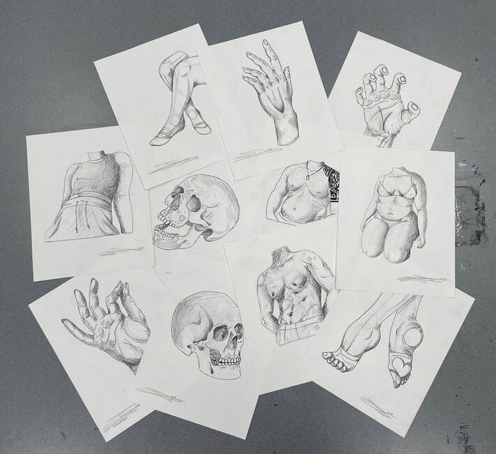
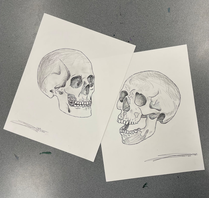
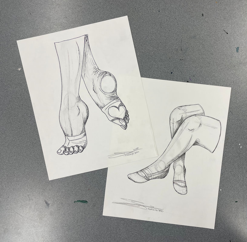
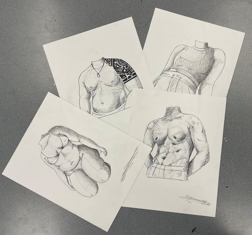
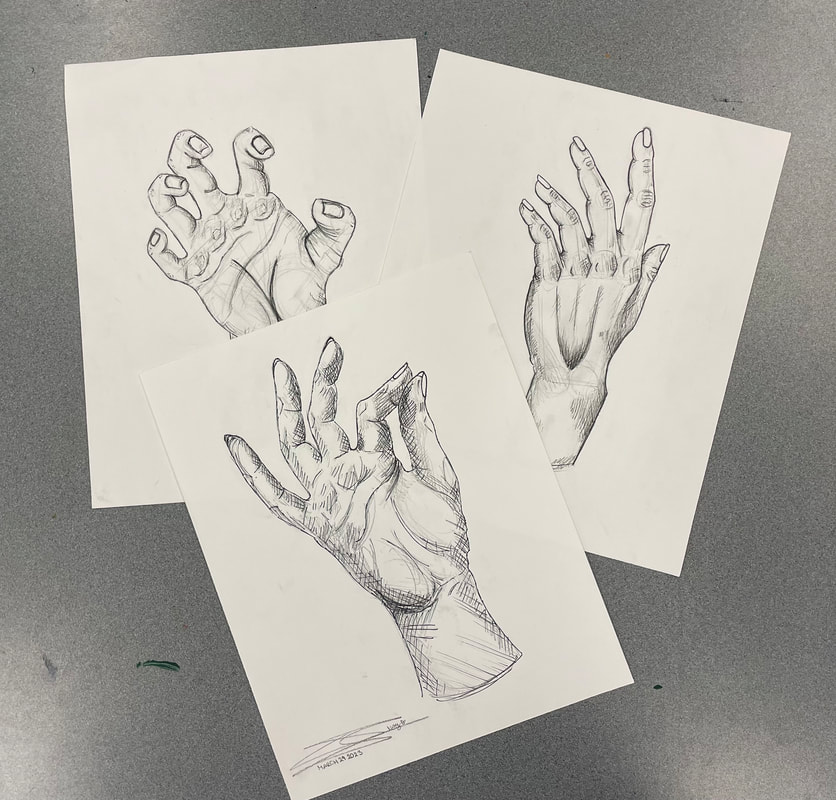
“Rendition of the Body”, 2023 is the second independent project I have completed in the VAM academy. Made with graphite and fine-tip pens, these drawings are micro-studies on different aspects of the human body. In total, there are 11 graphite and ink drawings separated into 4 categories; skulls, legs/feet, hands, and torsos. There are two drawings for each category, except for hands, which has three.
I decided earlier this year that this would be a project for progression, rather than pleasure. By understanding general human anatomy, one can further their art and include different perspectives and values in their art. I also returned to my starting mediums, paper and pencil, because I believe that understanding both traditional and digital art is crucial to an artist’s development.
The style of these drawings is a mix between new and old. The crosshatching (crossing of lines to build up value) are very maximalist, as my art tends to be, but this series of drawings takes realism and proportion to a new level. I love to combine techniques, and this was a perfect opportunity to do just that. I am proud of the products of this independent project and the different processes I took to complete it, and I can’t wait to include the things I have learned into my future pieces.
Grade 10 Independent Project (2021-22)
"The Contrast of Fantasy"
Progress Photos
The Contrast of Fantasy: Artist Statement
This Independent project was, in fact, very independent. I could barely keep up with my scheduled painting time. This project was tons of work, and in a sense, I am grateful for that. This project helped me regulate my time, schedule, and supplies, while having only myself to blame for mistakes. Acrylic paints are easy enough to use, but are messy and hard to blend, and watercolours take forever to dry, which certainly slowed my process.
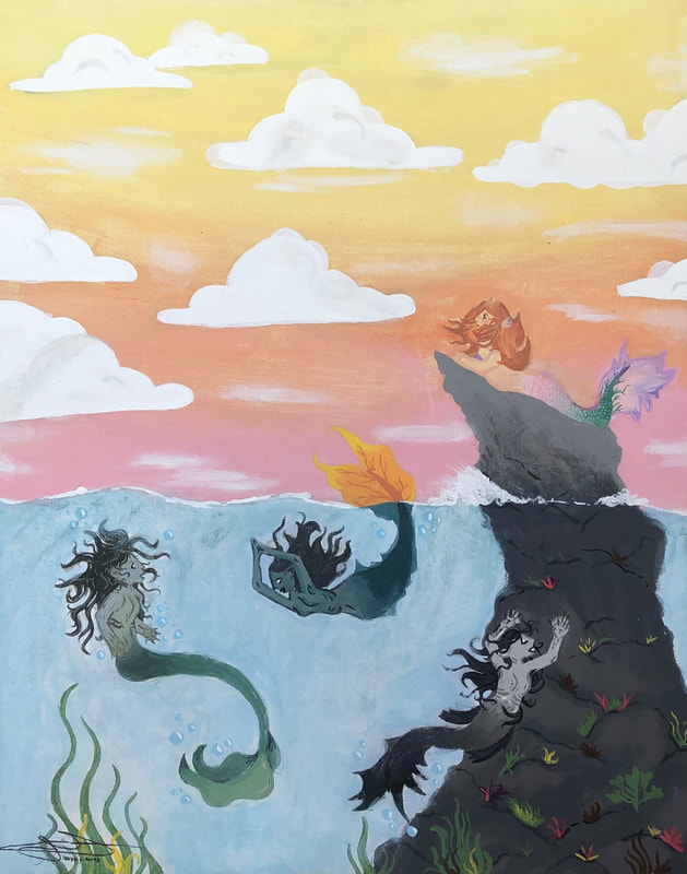
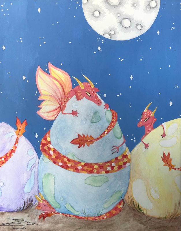
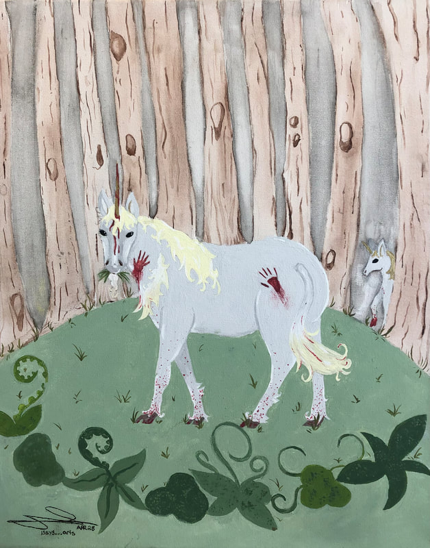
The “Contrast of Fantasy” is based on the first intentions and renditions of certain creatures versus the way large society currently perceives them. Colourful mermaids disappear under the water’s surface as smiling sirens, and vicious dragons shrink small and protect abandoned eggs they come across. I would say that the biggest influence of this artwork is definitely mythology. I love mythology, and it’s the stuff I read as a kid the most.
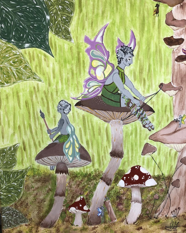
My art style is very detailed, and is made up of mostly organic shapes and curvy lines. I love putting extra details into plants, leaves, clothing (or in some cases, scales, and tails), and faces.
If I could change something about my pieces, it would be Warrior of the Forest. I love the painting, don’t get me wrong, but I cannot stand the background. I find it too overwhelming, and I wish I could redo it, but I will take the “less is more” mentality as a lesson in my next series. One thing that surprised me was all the under painting I did. I’m really glad I did it, because it made my life so much easier. I could briefly miss a spot, and it not be noticeable, thanks to the under painting. I was also surprised that this technique worked so well. I will surely be using it in the future.
Cartoonish and bright, my art brings me joy when I look at it, and I hope it brings joy to others, too.
The “Contrast of Fantasy” is based on the first intentions and renditions of certain creatures versus the way large society currently perceives them. Colourful mermaids disappear under the water’s surface as smiling sirens, and vicious dragons shrink small and protect abandoned eggs they come across. I would say that the biggest influence of this artwork is definitely mythology. I love mythology, and it’s the stuff I read as a kid the most.
My art style is very detailed, and is made up of mostly organic shapes and curvy lines. I love putting extra details into plants, leaves, clothing (or in some cases, scales, and tails), and faces.
If I could change something about my pieces, it would be Warrior of the Forest. I love the painting, don’t get me wrong, but I cannot stand the background. I find it too overwhelming, and I wish I could redo it, but I will take the “less is more” mentality as a lesson in my next series. One thing that surprised me was all the under painting I did. I’m really glad I did it, because it made my life so much easier. I could briefly miss a spot, and it not be noticeable, thanks to the under painting. I was also surprised that this technique worked so well. I will surely be using it in the future.
Cartoonish and bright, my art brings me joy when I look at it, and I hope it brings joy to others, too.
